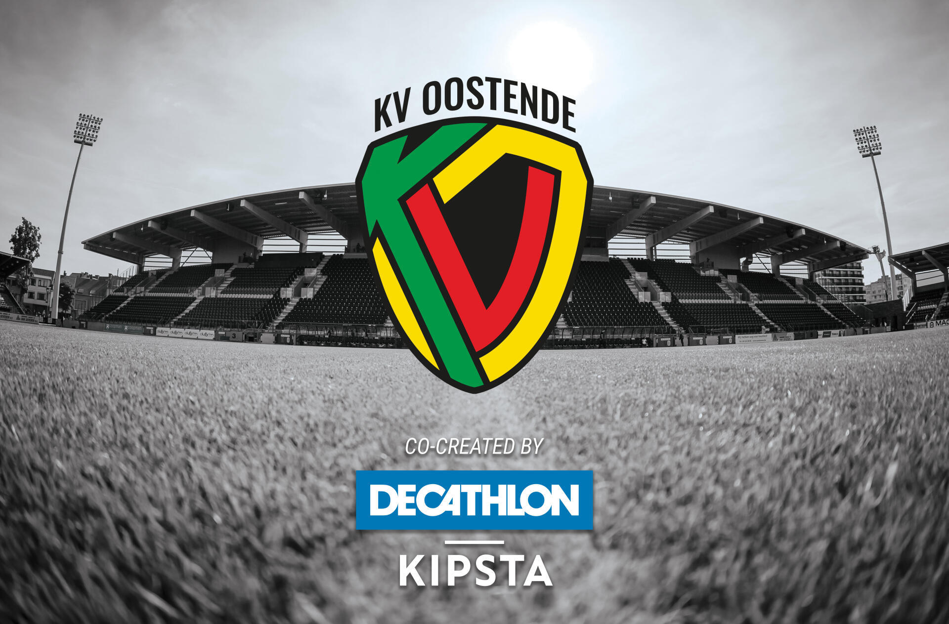
A new logo co-designed with kipsta.
KVO is celebrating its 40th birthday in 2021, a milestone that has not gone unnoticed.
To mark the occasion, the club launched a new logo and website on 31 May, a symbolically important figure, as 31 is the club's Belgian league registration number.
KV Oostende came into being on 22 June 1981, when AS Oostende and VG Oostende merged. Forty years on, the club is celebrating the launch of a new and innovative logo.
""The club had been contemplating a change of logo for some time now. Its 40th anniversary provided the perfect opportunity to make the change"," said Bram Keirsebilck, KVO's press and communications officer.
"If I'm honest about it, I didn't like the old logo at all"," said Thorsten Theys, the club's operations manager. ""We had a meeting with a supporters group at the start of the season and a change of logo was discussed then. We spoke about different designs."
"There were some good ideas but they were mostly based on old badges and logos"," commented KVO's executive chairman Gauthier Ganaye.
"While the club's history is important, we really wanted a new logo to mark our entry into a new era. It needed to be sleek, innovative and modern. Personally, I think Juventus' new logo really works."
Taking all that information on board, Decathlon got down to work.
""You might think this is a job for a graphic design company, but we've got a pretty large and skilled graphics department at Decathlon"," said Vincenzo Verhoeven, Decathlon's football club liaison manager.
"In working with KVO, we've not operated like a conventional kit supplier. We really want to make each other stronger and build an identity together. When it came to creating the club's new shirts, we launched a competition, asking the fans to come up with designs. But when we found out that KVO were looking for a new logo, we got down to work in house straightaway. After a few months of development, the logo was born. It might take some of the older fans a while to get used to, but I think it's a perfect reflection of the young, modern image that KVO wants to project under its new owners. And for the more nostalgic fans, the outline of the old badge is still visible."
"We are very pleased with the end result"," added Ganaye.
"We surprised a few people last season by playing an enterprising and attacking game, and I think this logo is an extension of what we saw on the pitch. It's bold, full of quality and youthful."


